 Call or text us! (703) 928-7309
Mobile-First Website Design: The Strategic Blueprint for 2026

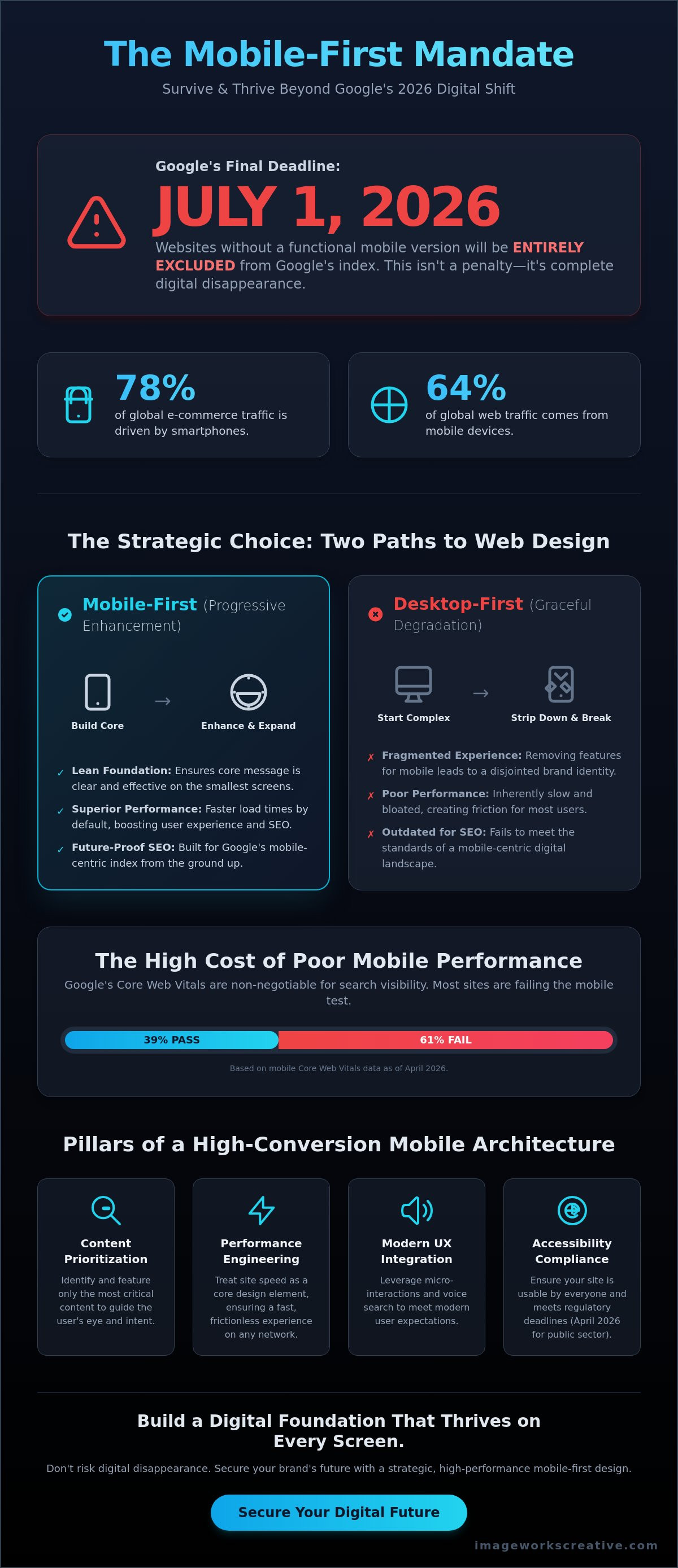
What if the desktop website you worked so hard to build simply vanished from search results overnight? By July 1, 2026, Google will entirely exclude websites from its index if they don't have a functional mobile version. This isn't a mere ranking dip; it's a complete digital disappearance. Many businesses still treat their mobile site as a stripped-down version of their desktop original. This often leads to slow loading speeds and disappointing conversion rates. If your mobile traffic isn't performing, you're likely losing out on the 78% of global e-commerce traffic now driven by smartphones.
Achieving an effective mobile first website design is the only way to secure your brand’s future in this performance-driven era. You deserve a digital presence that feels native on every device and captures every lead. We've developed a strategic blueprint to help you master mobile-first architecture and build a high-conversion platform that scales from the smallest screen to the largest enterprise. You’ll learn how to prioritize your most potent content, meet the April 2026 accessibility deadlines, and leverage a framework that turns mobile visitors into loyal customers. Let's build a foundation that thrives on every screen.
Mastering mobile first website design requires a fundamental shift from stripping desktop features to progressive enhancement. It's about building a robust foundation from the smallest screen up. This strategic priority ensures your site survives Google's July 1, 2026, exclusion deadline and thrives in an increasingly mobile-centric index.
Success depends on ruthless content prioritization. By identifying the 'must-haves' for a six-inch screen, you create a strategic visual hierarchy that guides the eye. This approach transforms the 78% of e-commerce traffic coming from smartphones into a high-conversion stream that fuels your business growth.
Understand that responsive design is the technical 'how', but mobile first website design is the strategic 'when'. A website can be technically fluid yet still fail the user if the design order is flawed. Don't settle for a site that's just responsive; choose a strategy that prioritizes the user's immediate needs and intent.
Integrate modern UX best practices like micro-interactions and voice search to meet 2026 standards. These high-caliber details provide instant feedback and cater to how people actually talk to their devices. Such precision ensures your site remains accessible and compliant with the April 2026 regulatory deadlines for public sector entities.
Our approach focuses on synergy; we engineer every digital component to function as a single, high-performance unit. We ensure your bespoke brand identity translates perfectly to the small screen without losing its artistic soul. This holistic method elevates your digital presence from simple production to a high-level creation that drives results.
What is Mobile-First Website Design? Beyond the Small Screen
Mobile first website design is a strategic distillation. It’s a design philosophy that prioritizes the mobile user experience before expanding to larger screens. Think of it as leading with your most potent value. In 2026, mobile devices account for approximately 64% of global web traffic. This is no longer a "mobile-friendly" checkbox; it is the baseline for digital survival. We don't just shrink a desktop layout to fit a phone. We engineer the experience from the ground up to ensure every interaction feels intentional and precise.
A mobile-optimized experience builds immediate trust. When a high-value client interacts with a site that feels native to their device, they perceive a brand that is attentive and visionary. Conversely, a clunky mobile site suggests a lack of technical proficiency. It creates friction. Your digital presence must function as a single, high-performance unit to capture these mobile-first opportunities. By focusing on the mobile journey first, you ensure that your core message is never lost in the transition between devices.
Progressive Enhancement vs. Graceful Degradation
The technical shift from "Graceful Degradation" to "Progressive Enhancement" defines modern web standards. Graceful degradation starts with a complex desktop site and strips away elements for smaller screens. This often results in a fragmented brand identity and slow loading speeds. It’s essentially trying to fix a broken experience after the fact. Progressive enhancement flips the script. We build a solid, lean foundation for the mobile user first. We then layer on complexity for larger viewports. This ensures a bespoke feel regardless of screen size. While Responsive web design provides the technical fluidity to adapt layouts, the mobile-first approach dictates the order of priority. Starting lean improves site speed and technical performance from the ground up, creating a faster, more reliable product for every visitor.
Why Mobile-First is the Foundation of Modern SEO
Google’s indexing is now entirely mobile-centric. The mobile version of your site is the primary version for ranking, even for desktop searches. Design choices directly impact Core Web Vitals. Only 39% of websites passed all three mobile Core Web Vitals as of April 2026. If your mobile site fails these benchmarks, your search visibility will plummet. The cost of ignoring this is high. As of July 1, 2026, websites lacking a functional mobile version will be entirely excluded from Google's index. This isn’t a penalty; it’s a digital disappearance. Prioritizing mobile first website design ensures your rankings remain secure and your bounce rates stay low. It’s the ultimate synergy of creative execution and technical SEO, positioning your brand as a leader in a mobile-driven economy.
The Core Pillars of Mobile-First Architecture
The foundation of any high-conversion digital presence begins with a fundamental shift in perspective. You aren't just designing a website; you're engineering a portable brand experience. This requires a commitment to the technical definition of mobile-first, which dictates that we solve for the most constrained environment before scaling up. Mobile first website design isn't about what you can fit. It's about what you can't afford to leave out. When screen real estate is limited to a few square inches, every pixel must justify its existence. We guide the eye through a deliberate visual hierarchy that ensures your primary value proposition is never missed.
Performance engineering is the heartbeat of this architecture. In 2026, website speed is a critical design element. Search engines and AI discovery tools factor performance directly into visibility. A delay of just a few hundred milliseconds can cause a potential client to bounce before your logo even loads. This is especially true for mobile users who expect instant gratification. We treat speed as a feature, not a technical afterthought. Every millisecond saved is a step toward a higher conversion rate.
Strategic Content Distillation
Content distillation is the process of removing noise to amplify the brand's core message. We begin with a rigorous content inventory to audit what your user actually needs in the moment of discovery. For complex professional services, like legal or medical firms, this means prioritizing clarity over volume. A potential patient doesn't need a 2,000-word history of your practice on their phone. They need a click-to-call button, your primary specializations, and immediate proof of expertise. We help clients strip away the clutter to ensure their custom web design leads with high-impact value. This distillation forces a brand to lead with its most potent offerings, ensuring the message resonates instantly.
Designing for the 'Thumb Zone'
Touch-first navigation is the evolution of user interface design. We've moved far beyond the standard "hamburger menu" into a world of intuitive, thumb-zone ergonomics. Most users interact with their devices using one hand. This creates a natural arc across the screen where the thumb can reach comfortably. We map these high-reach areas to place your most critical interactive elements. High-impact CTAs belong in the natural "sweet spot" of the lower two-thirds of the screen.
Properly spaced elements are essential to eliminate frustrating "fat-finger" errors. If a user accidentally clicks your privacy policy when they meant to "Book a Consultation," you've lost momentum. By engineering for the physical reality of how people hold their phones, we create a sense of effortless synergy between the user and the interface. This attention to detail is what separates a generic site from a bespoke digital creation. It ensures your brand feels accessible and responsive to every touch.
Mobile-First vs. Responsive Design: A Strategic Comparison
Responsive design is the 'how'; mobile first website design is the 'when'. While technical fluidity ensures your site fits a screen, it doesn't guarantee a quality experience. A site can be perfectly responsive yet fundamentally flawed. If you start with a massive desktop canvas and try to cram that complexity into a mobile viewport, the result is often a cluttered, frustrating mess. This is the 'Desktop-Down' trap. It leads to fragmented brand identities and technical debt that slows down your growth. A true mobile first website design avoids these pitfalls by prioritizing the user's immediate context from the first line of code. It ensures your site isn't just a shrunken version of a desktop experience, but a purposeful, high-performance tool.
Investing in mobile-first architecture is a commitment to long-term scalability. It’s about more than just fitting content. It’s about engineering for the user's immediate needs. When you design for the smallest screen first, you force a strategic distillation of your value proposition. This ensures that every element on the page is purposeful. It creates a lean, high-performance foundation that scales beautifully as you move toward larger enterprise-level screens. This thorough approach eliminates technical jargon in favor of clear, results-oriented execution that drives measurable business growth.
The Limitations of Desktop-First Thinking
Starting with the big screen often leaves mobile users with 'hidden' elements. These assets still load in the background, dragging down speeds and hurting your Core Web Vitals. Desktop sites forced into a vertical column feel cramped. They lack the breathing room necessary for a premium feel. By utilizing user-centric design principles, we solve these friction points at the source. We prioritize the mobile journey, ensuring your brand identity remains cohesive and impactful without the weight of unnecessary desktop clutter. This creates a synergy between your brand's artistic side and its technical performance.
When to Choose a Mobile-First Strategy
High-growth firms must evaluate their traffic patterns. In the U.S., 57% of web traffic comes from mobile devices as of March 2026. B2B and professional services are witnessing a massive shift. Decision-makers now conduct their initial due diligence on smartphones while in transit or between meetings. To understand What Is Mobile-First Design?, one must recognize it as a growth engine. Is your current site truly mobile-first? Or is it just 'mobile-friendly'? The difference lies in the design order. A mobile-friendly site is a desktop site that survived the transition. A mobile-first site is a bespoke strategic tool built to convert from day one.
Mobile UX Best Practices for 2026
Mobile first website design has moved beyond static layouts into a realm of high-caliber, interactive experiences. In 2026, the standard for professional authority is set by micro-interactions. These small, purposeful animations provide instant feedback, confirming a user’s action with a subtle visual cue. This creates a sense of tactile synergy between the visitor and the interface. Voice search integration is equally vital. People don't talk to their phones the way they type on a keyboard. We design for natural language patterns to ensure your site is discoverable by AI-powered search tools. AI-driven personalization now allows for dynamic layouts. These interfaces adapt to user behavior in real-time, serving the most relevant content based on past interactions.
Accessibility is a fundamental pillar of our approach. By April 24, 2026, state and local government websites in the U.S. serving populations over 50,000 must comply with WCAG 2.1 Level AA standards. We treat ADA compliance audits as a core part of the design process, not a technical add-on. This ensures your site is usable by everyone. It also serves as a significant quality signal for search engines. A site that welcomes all users projects a brand that is both attentive and inclusive. Partner with us to engineer a bespoke mobile experience that drives growth and meets these critical standards.
The Role of Speed and Performance
Speed is the silent architect of success. Image optimization and lazy loading are non-negotiable requirements in 2026. These technical choices directly impact how to improve website conversion rate by reducing user friction. 'In 2026, mobile speed is no longer a feature; it is the primary driver of user retention and brand authority.' If your site takes more than two seconds to load, you've already lost the opportunity to engage a high-value client. We prioritize technical proficiency to ensure your brand remains competitive in an era of instant gratification.
Future-Proofing for New Form Factors
We design for a fluid future. The transition from static pages to fluid experiences is well underway. Your mobile first website design must adapt to foldables, wearables, and varied aspect ratios without losing its artistic soul. We avoid intrusive pop-ups and interstitials. These elements frustrate users and trigger Google penalties. Instead, we focus on a seamless journey that feels native to any device. This forward-thinking mindset ensures your digital presence remains relevant as new hardware emerges. It’s about building a foundation that is stable, trustworthy, and ready for whatever comes next.
The ImageWorks Approach: Synergy in Mobile Design
Synergy is our signature. We don't view mobile first website design as a technical chore or a set of constraints. We see it as a strategic distillation of your brand's most potent value. At ImageWorks Creative, we engineer mobile experiences to function as a single, high-performance unit. Every element, from the backend architecture to the visual hierarchy, is designed to work in perfect harmony. This holistic rhythm ensures your high-level creation translates seamlessly across all form factors. It's about more than just fitting a screen; it's about capturing an audience through technical proficiency and artistic innovation.
Your brand identity is bespoke. It shouldn't feel like a stripped-down version of itself on a smartphone. We specialize in the integration of creative and strategic elements, ensuring your artistic vision remains intact on even the smallest display. This meticulous attention to detail is a core pillar of our custom website design services. We bridge the gap between technical performance and plain-spoken business benefits. The result is a digital presence that signals modern technical awareness while remaining focused on the ultimate goal of business growth. We take our work seriously but approach every project with a sense of creative excitement.
Bespoke Solutions for Professional Services
We carry the weight of an established industry veteran. Our 30-year history in the evolution of the web provides a sense of reliability and seasoned expertise. We've navigated every major shift in digital platforms, from the early desktop era to the mobile-first landscape of 2026. This stable foundation allows us to transform medical and legal sites into high-conversion mobile leaders. Stability is paramount. We provide secure, high-performance hosting to ensure your mobile site remains fast and accessible at all times. Every millisecond counts. We treat technical SEO and performance as necessary pieces of a larger puzzle, engineered for excellence.
Your Next Steps Toward a Mobile-First Future
The transition from a vendor relationship to a strategic partnership begins with a clear understanding of your current performance. We invite you to request a comprehensive mobile UX audit of your existing site. This isn't just a surface-level check; it's a deep dive into how your brand interacts with the 64% of global traffic now coming from mobile devices. We project the image of a team that is deeply integrated into your success. Let's start a human-to-human dialogue about your firm's growth goals. We are ready to act as your proactive partner and visionary guide. Reach out today to begin your transformation into a mobile-first leader.
Securing Your Digital Dominance in a Mobile-First World
Designing for the smallest screen first isn't just a technical requirement. It's a strategic distillation that forces your brand to lead with its most potent value. By prioritizing mobile first website design, you ensure your site survives Google's 2026 indexing shift and thrives in an experience-first economy. Success in this landscape requires a meticulous blend of performance engineering, intuitive thumb-zone navigation, and total accessibility. These elements aren't separate features; they are the essential components of a robust digital foundation that captures attention and drives action.
ImageWorks Creative has been an award-winning agency since 1997. We bring decades of specialized expertise to the legal, medical, and tech sectors. We don't just build sites; we engineer a comprehensive synergy between design, SEO, and branding to ensure your digital presence functions as a single, high-performance unit. This holistic approach has allowed us to navigate every major digital evolution alongside our partners. Ready to transform your digital presence? Collaborate with ImageWorks Creative today. Your vision deserves a platform that scales from the palm of a hand to the largest enterprise. Let's build something exceptional together.
Frequently Asked Questions
Is mobile-first design the same as responsive design?
No, they are distinct but related concepts. Responsive design is the technical execution that allows a layout to fluidly adapt to different screen sizes. In contrast, mobile first website design is a strategic philosophy that dictates the order of the design process. It prioritizes the mobile user's intent and constraints before adding complexity for larger enterprise displays. This approach ensures your most potent value is delivered first.
Will a mobile-first approach make my desktop website look too simple or empty?
Absolutely not. We utilize a process called progressive enhancement. This means we build a robust, lean foundation for the smallest screens and then layer on high-caliber aesthetic details and features as the viewport expands. Your desktop site remains a high-level creation with all the visual depth your brand requires. It simply benefits from the structural clarity and performance gains established during the mobile phase.
How does mobile-first design affect my Google search rankings?
It is now the primary factor for visibility. Google uses mobile-first indexing, meaning it evaluates the mobile version of your site to determine rankings for all searches. If your mobile experience is poor, your desktop rankings will suffer. By the July 1, 2026 deadline, Google will entirely exclude sites from the index if they lack a functional mobile version. This makes a mobile first website design essential for search engine optimization success.
Do I need a separate mobile app if I have a mobile-first website?
For most professional services, a high-performance mobile website is more than sufficient. Modern web technology allows us to engineer mobile experiences that feel native and responsive without the high maintenance costs of a separate app. This creates a synergy between your digital channels. It ensures that every visitor has immediate access to your services without the friction of a download, maximizing your conversion opportunities.
What are the most common mistakes in mobile-first design for 2026?
The most frequent errors involve ignoring Core Web Vitals and failing to meet accessibility standards. Many sites still use intrusive pop-ups that trigger Google penalties or layouts that ignore the ergonomic thumb zone. Another critical mistake is missing the April 24, 2026 deadline for WCAG 2.1 Level AA compliance for public sector entities. We avoid these pitfalls by treating technical proficiency and user-centric design as a single, integrated unit.
Can I convert an existing desktop-first site into a mobile-first one?
Yes, though it requires a strategic architectural shift. We begin with a thorough content inventory to identify your core messages. We then rebuild the site using a mobile-first framework to eliminate the technical debt and slow speeds associated with old desktop-first models. This transformation turns a legacy site into a modern growth engine. It’s an investment in long-term scalability and brand authority.
How much does a custom mobile-first website design cost?
The investment for a bespoke digital presence varies based on the complexity of your requirements and the scope of the synergy between different departments. Every project we lead is a unique creation tailored to specific business goals. We focus on delivering exceptional quality and measurable results rather than off-the-shelf software. To get an accurate assessment for your firm, we recommend starting a direct dialogue to discuss your vision and technical needs.

